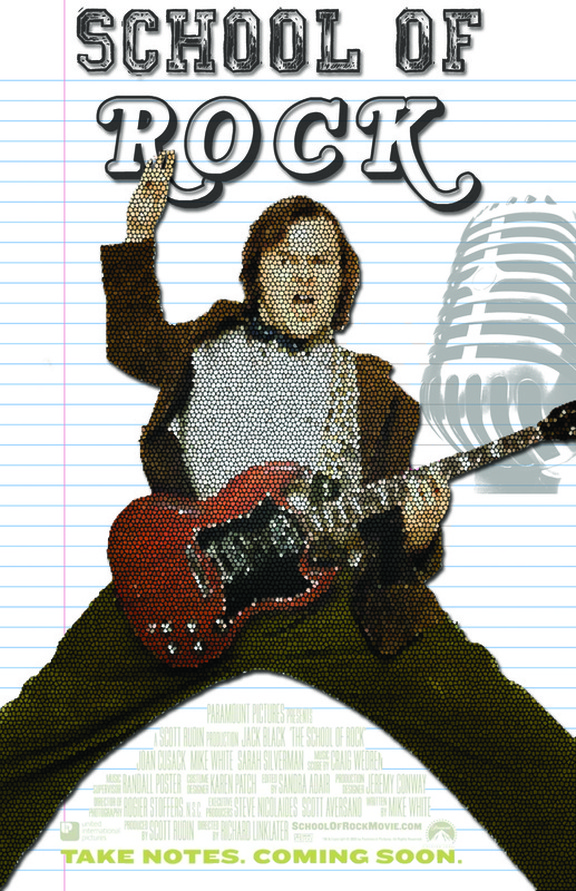
School of Rock
I wanted the background of the poster to be connected to the theme of school, so I made the background a piece of line paper. The text used in the poster is a classic Rolling Stones font to relate the poster the music. The old school microphone gives the movie poster a retro look it is placed in the foreground of the poster to add depth. The main character of the movie Jack Black is placed in the centre of the poster because he is the main concept. The filter is place over the character to make the view want to look closer into the detail of him
I wanted the background of the poster to be connected to the theme of school, so I made the background a piece of line paper. The text used in the poster is a classic Rolling Stones font to relate the poster the music. The old school microphone gives the movie poster a retro look it is placed in the foreground of the poster to add depth. The main character of the movie Jack Black is placed in the centre of the poster because he is the main concept. The filter is place over the character to make the view want to look closer into the detail of him
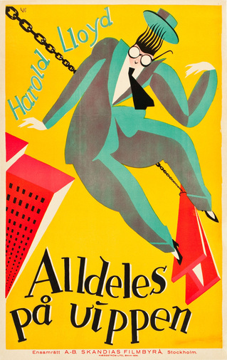
Alldeles På Vippen
This poster was created in 1924 by Curt Peters. I like the yellow, red, and teal colour scheme that Curt uses in this poster. When I look at the poster my attention goes to the character he looks like he is falling through the sky because he is overlapping the beam. The contrast between the colours teal and grey makes the character look 3D. The yellow background makes the whole poster catch your eye and stand out. The font of the poster flows with the theme that the character is falling through the sky.
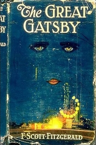
The Great Gatsby
I like the blue, yellow and white colour scheme that is used in this poster. The bright yellow city catches the viewers attention and lightens up the mood. I like that this poster is hand drawn. The contrast between the white font and the blue sky makes the title stand out. The font that is used gives the poster a classy look. The face that is in the night sky is very curious and mysterious. The dark blue around the eyes gives depth to the eyes. The eyes are very realistic and grab your attention.
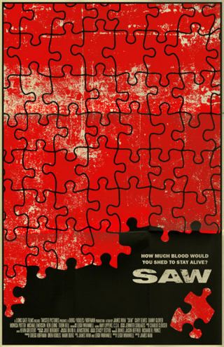
Saw
I like this poster because it is simple yet shows a deeper message. The poster compares to the story line of the movie, you have to figure out the puzzle to stay alive. After your first look at it you can see the poster is about a horror movie. The red puzzle pieces make the poster highly visible and resembles blood splatters. The title of the movie stands out because it is on a black background with bold letters. I like this poster because it makes me wonder, it makes me feel curious to put the puzzle together.
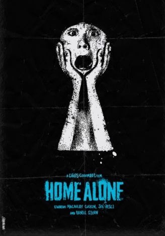
Home Alone
I like how simple yet powerful this poster is. The contrast between the black and white makes the character stand out. The characters hands are large and come to meeting point which makes the attention go to his face. There is strong emotion that you can see in the characters face. It almost looks like the character is holding a mask on his face. The blue font on the black background makes the title stand out. I like the splatters behind the title and the font that is used on the on the movie poster.
I like how simple yet powerful this poster is. The contrast between the black and white makes the character stand out. The characters hands are large and come to meeting point which makes the attention go to his face. There is strong emotion that you can see in the characters face. It almost looks like the character is holding a mask on his face. The blue font on the black background makes the title stand out. I like the splatters behind the title and the font that is used on the on the movie poster.
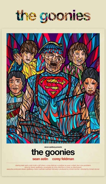
The Goonies
I like this poster because of the bright colours and filter that is used on the characters. The border around the characters makes the title stand out. I like how the title has the same filter as the characters do. The font that is used follows along with the theme of the movie, and because it is repeated twice you remember the movie title. I like how the darker colours are in the background and that brings the characters to the foreground and makes them the main concept on the screen. The superman symbol on the characters chest is the main point of focus.
I like this poster because of the bright colours and filter that is used on the characters. The border around the characters makes the title stand out. I like how the title has the same filter as the characters do. The font that is used follows along with the theme of the movie, and because it is repeated twice you remember the movie title. I like how the darker colours are in the background and that brings the characters to the foreground and makes them the main concept on the screen. The superman symbol on the characters chest is the main point of focus.
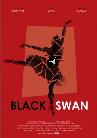
Black Swan
This movie poster gains my attention because it is simple and really catches my eye. I like the black, red, and white colour scheme. The red background brings text and images to the foreground so the image stands out. I like how this poster shows the white swan is on the inside of the black swan. The black swan is a print of a ballerina broken in to pieces. I like the colour of the text because the contrast between the black and white makes the title bold.
This movie poster gains my attention because it is simple and really catches my eye. I like the black, red, and white colour scheme. The red background brings text and images to the foreground so the image stands out. I like how this poster shows the white swan is on the inside of the black swan. The black swan is a print of a ballerina broken in to pieces. I like the colour of the text because the contrast between the black and white makes the title bold.
