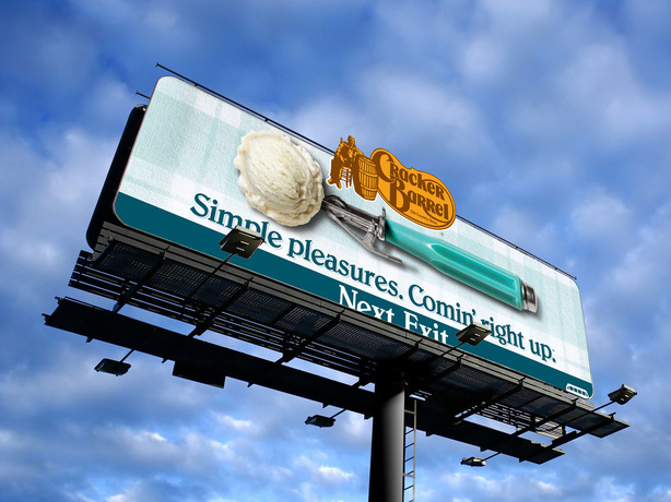
Cracker Barrel
I like this billboard because I like the light blue colour scheme that is used. I like how much the logo stands out because it is yellow on a blue background. I like how light and simple the plaid background is. The ice-cream scoop in the middle of the billboard catches all the viewers attention. The font that is used on the billboard is very simple but it stands out very well.
I like this billboard because I like the light blue colour scheme that is used. I like how much the logo stands out because it is yellow on a blue background. I like how light and simple the plaid background is. The ice-cream scoop in the middle of the billboard catches all the viewers attention. The font that is used on the billboard is very simple but it stands out very well.
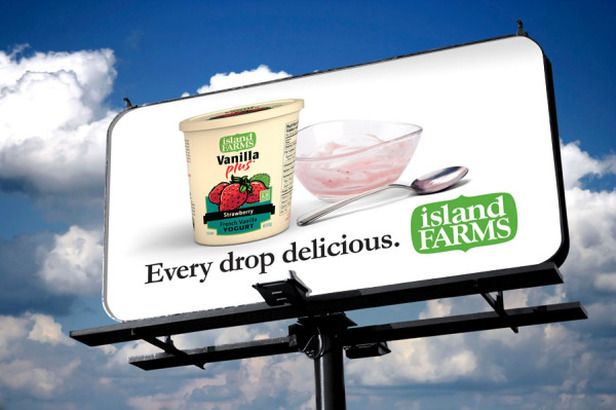
Island Farms
I like this billboard because I like how simple it is. There is not much detail needed to get your message across. The ice cream box draws your attention to the middle of the billboard. The white background brings everything forward. The logo is bright green and stands out very well because it is so big. I like the green, pink and white colour scheme that is used in this billboard.
I like this billboard because I like how simple it is. There is not much detail needed to get your message across. The ice cream box draws your attention to the middle of the billboard. The white background brings everything forward. The logo is bright green and stands out very well because it is so big. I like the green, pink and white colour scheme that is used in this billboard.
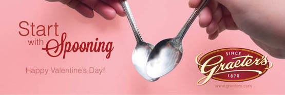
Graeter's
I like the red and pink colour scheme that is used for this billboard. The logo in the bottom right conner catches your attention because it is a dark colour on a light background.I like how the two spoons meet together to make a heart shape.
I like the red and pink colour scheme that is used for this billboard. The logo in the bottom right conner catches your attention because it is a dark colour on a light background.I like how the two spoons meet together to make a heart shape.
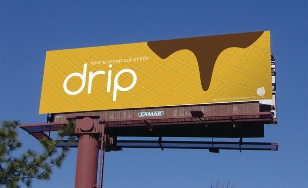
Drip
I like this billboard because it catches my attention. The background is meant to look like and ice cream cone with chocolate ice cream dripping on it. The poster is well balanced because the two main thing on the poster are seen as one. The word "drip" stands out because it is white on a coloured background. I like the brown, orange, and white colour scheme.
I like this billboard because it catches my attention. The background is meant to look like and ice cream cone with chocolate ice cream dripping on it. The poster is well balanced because the two main thing on the poster are seen as one. The word "drip" stands out because it is white on a coloured background. I like the brown, orange, and white colour scheme.
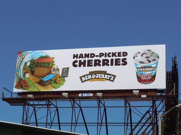
Ben & Jerry
I like this billboard because it has so many different things to it. I like the left side because it promotes the farms that the cherries are picked from for the ice-cream. It looks like a detailed drawing with bright colours. The centre of the billboard catches your attention because the font is bold. The white background brings the logo to the foreground. I like the right side because promotes the ice-cream and makes the viewer want to try the product.
I like this billboard because it has so many different things to it. I like the left side because it promotes the farms that the cherries are picked from for the ice-cream. It looks like a detailed drawing with bright colours. The centre of the billboard catches your attention because the font is bold. The white background brings the logo to the foreground. I like the right side because promotes the ice-cream and makes the viewer want to try the product.
